Challenge
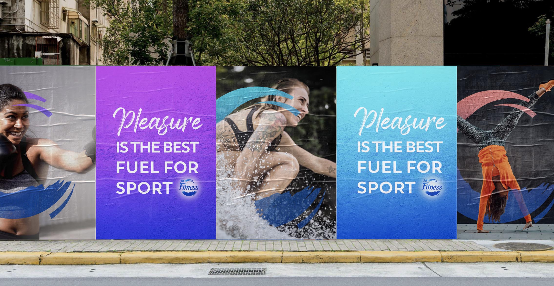
Historically anchored in the diet management, FITNESS wanted to break with this perception and shift to a more relevant territory: becoming the advocate of being physically active, with the belief that we should never lose the enjoyment to get and stay fit, because when we enjoy something, we stick with it. The main objective being to emphasize FITNESS’ biggest strength into the great balance of health and taste and increase relevance among younger users.
Solution
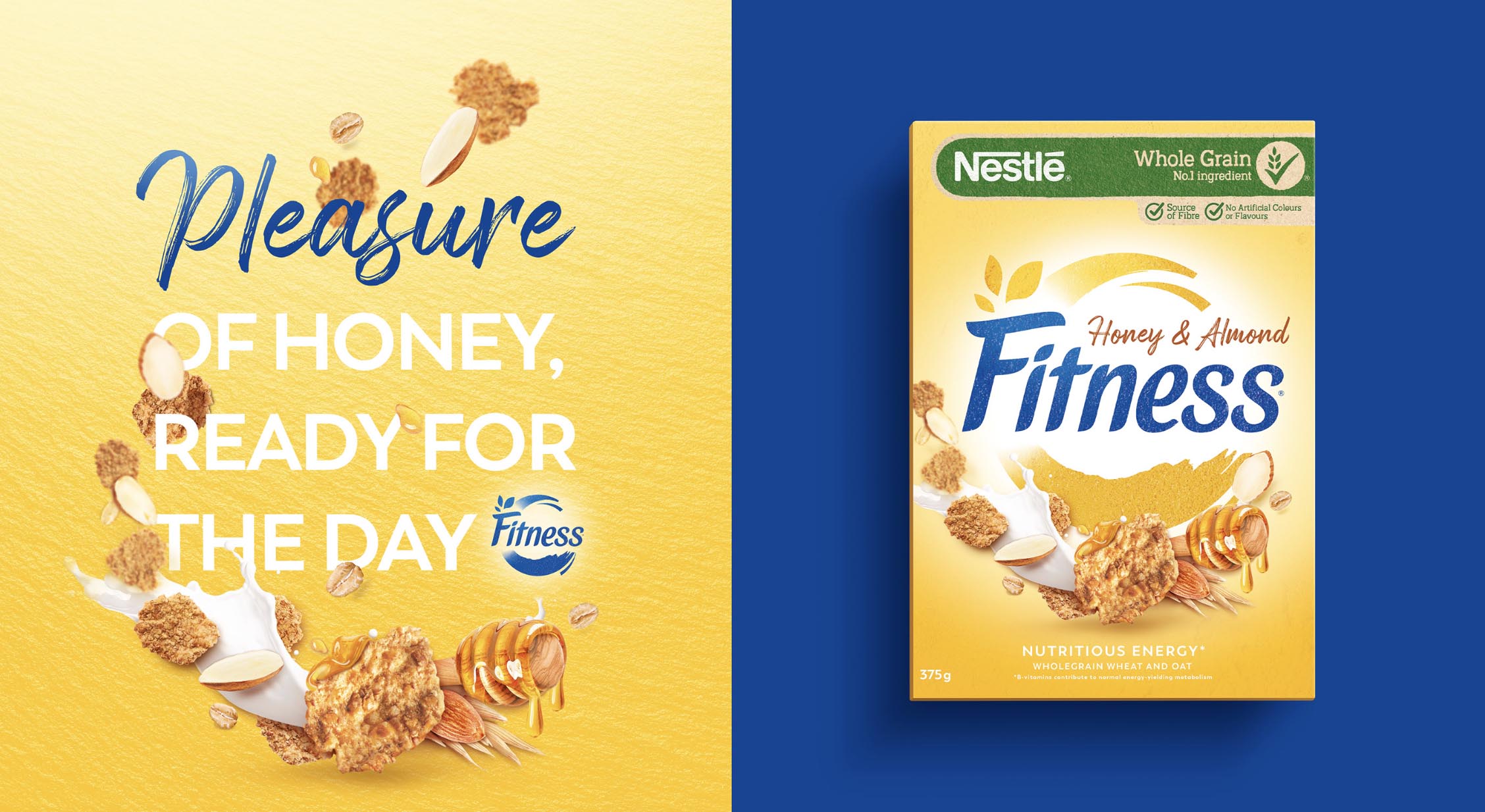
To reflect consumers evolving attitude towards health and wellness, the brand shifted the focus on iconising its emerging asset: the wave. This wave of goodness inspires the virtuous cycle of eating well and being physically active. The new design also highlights the enjoyment of being fit: the pleasure of doing sport and eating well.
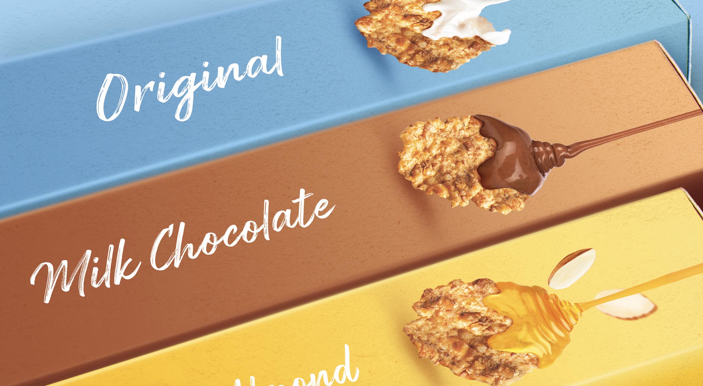
This global redesign started with the cereals portfolio, followed by a global rollout across the other categories (granola, bars, confectionery and other innovations). This iconisation was pushed even further by installing an ownable and iconic brand Universe.
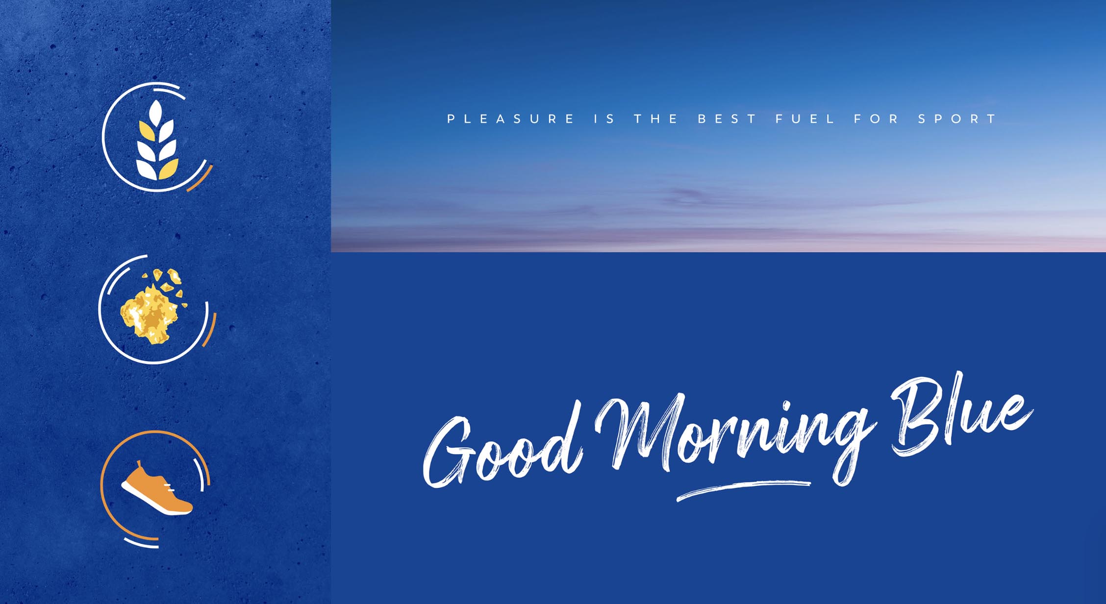
The modern, dynamic and colourful brand universe puts the wave at the centre of the system, always in interaction with other assets, therefore creating a stronger consistence throughout all applications.


